At RedSea Digitals, we create smart and flexible designs that adapt seamlessly to any device mobile, tablet, or desktop. Our responsive approach ensures consistent user experience, faster loading, and higher engagement across platforms.
With a focus on usability and performance, our responsive designs not only look great but also function flawlessly across all screen sizes. We ensure your brand stays consistent, accessible, and impactful—no matter where your audience connects with you.

We prioritize mobile-first design to ensure your website looks and performs flawlessly on smartphones before scaling to larger devices.

We design interfaces that deliver smooth navigation and consistent functionality across all devices for a flawless user journey.

We carefully optimize every design element to ensure your website loads quickly, keeping visitors fully engaged and reducing bounce rates significantly.

Our responsive designs follow SEO best practices, improving search rankings and driving more organic traffic to your website.

We ensure your brand’s identity, colors, and style remain consistent across all devices, delivering a unified experience to your audience.

Our responsive designs are built to adapt to new devices and evolving technologies, keeping your brand consistent and relevant for years to come.
At RedSea Digitals, we create responsive websites that look stunning and perform flawlessly across all devices. Our mobile-first approach, fast-loading pages, and seamless user experience ensure your brand stays consistent, accessible, and engaging for every visitor.

We design responsive websites by understanding goals, researching trends, creating flexible layouts, refining designs, and delivering fast, SEO-friendly, engaging experiences.
We start by understanding your business objectives, target audience, and device priorities to create a responsive design that truly meets your needs.
We analyze industry trends, competitors, and best practices to gather insights and craft innovative, responsive designs that stand out.
We create wireframes and conceptual layouts to plan flexible, user-friendly designs that adapt seamlessly across all devices.
We craft visually appealing designs paired with engaging content to deliver a seamless, user-friendly experience on every device.
We collaborate with you to review and refine the design, ensuring it’s fully responsive, user-friendly, and aligned with your brand.
Once approved, we finalize your responsive design and launch it across all devices, ensuring optimal performance and user experience.
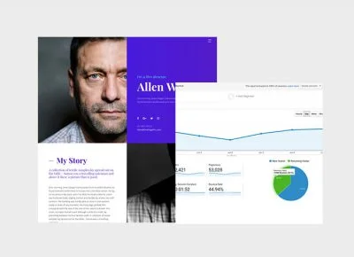
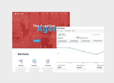
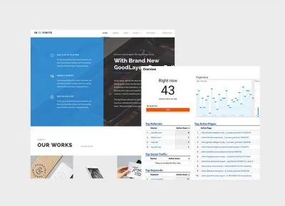
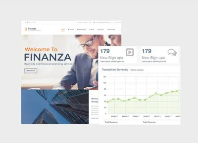
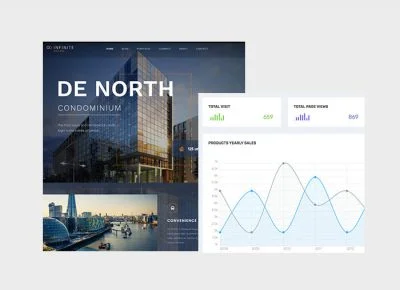
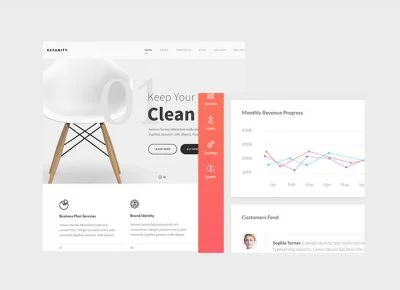
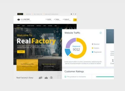
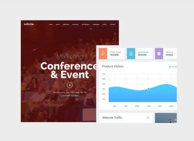
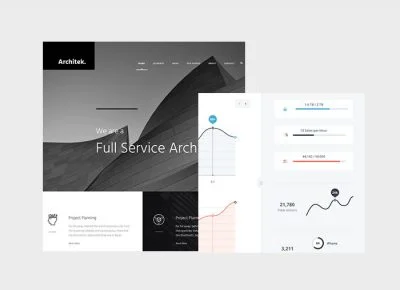
A SnapChat of how our Clients are experiencing competitive advantages
The moment; and yet I feel that I never was a greater artist than now. When, while the lovely valley teems with vapour around me, and the meridian sun strikes the upper surface of the impenetrable foliage.
Email info@redseadigitals.com
Call Now! +91 9310355211